Lattice Insight, LLC
​Mathematical Statistics Consulting
Follow/Contact
  • Home
  • About
  • Projects
  • Contact
  • Blog

From data to decisions

Let a professional mathematician and statistician help you make evidence-based decisions.

Download our presentation

International alliance with the United States

7/9/2020

0 Comments

 
The map below provides one way to estimate the closeness of the alliance between the countries of the world and the United States. It is based on the US State Department's annual report, Voting Practices in the United Nations. We focus on the last 3 calendar years, 2017-2019, and votes in the UN General Assembly identified by the US State Department as "important" policy votes. The State Department awards a point for full agreement, and a half-point for partial agreement, with American votes in the UN General Assembly. The scores for the last 3 years were averaged together to create the following graphic. In this graphic, blue represents complete agreement, and red represents complete disagreement.
Picture
Here are the scores for selected countries.

100%: USA
96.7%: Israel
84.0%: Canada
78.2%: Australia
58.4%: United Kingdom
58.1%: Italy
57.3%: France
57.0%: Germany
54.6%: Japan
46.0%: Mexico
41.9%: Brazil
35.9%: Nigeria
29.7%: Bangladesh
29.4%: India
28.1%: Pakistan
​25.5%: Indonesia
20.7%: Russia
14.1%: China
0 Comments

Rely on the data: racism around the world

7/7/2020

0 Comments

 
The question on everyone's mind these days is: how racist is America? To put things in context, it would help to compare America to other countries.

We rely on a graphic from a Washington Post story: www.washingtonpost.com/news/worldviews/wp/2013/05/15/a-fascinating-map-of-the-worlds-most-and-least-racially-tolerant-countries/

​
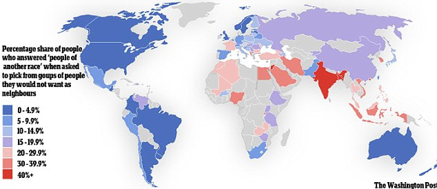
This story reported on a study done in 2013 by the World Values Survey, based in Sweden. They asked people around the world whether they were willing to have a neighbor of a different race. A higher score on this survey represents lower racial tolerance, shown in red on the map. A lower score represents higher tolerance, shown in blue on the map; see below.
Picture
Jordan and India were by far the least racially tolerant countries in the survey. The Americas (including the United States), northern Europe, Australia, and New Zealand were the most racially tolerant.

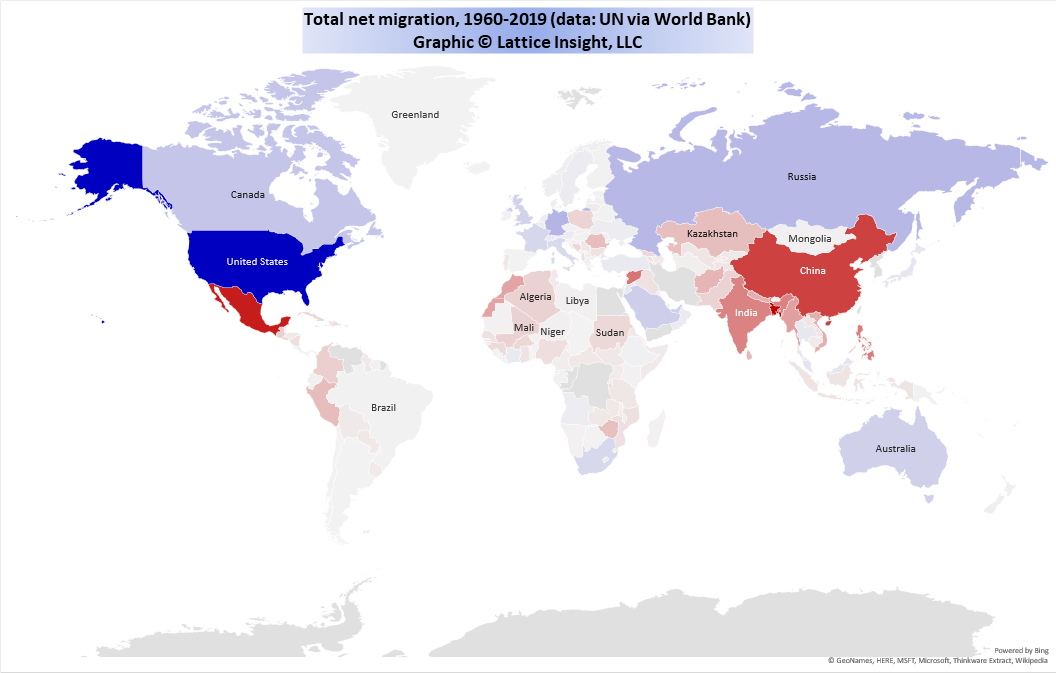
​Next, we examine migration data from the United Nations. The following map represents total net migration from 1960 to 2019. Blue countries have net immigration (inflow of people), red countries have net emigration (outflow of people), and the deepness of the color represents the number of people migrating.
Picture
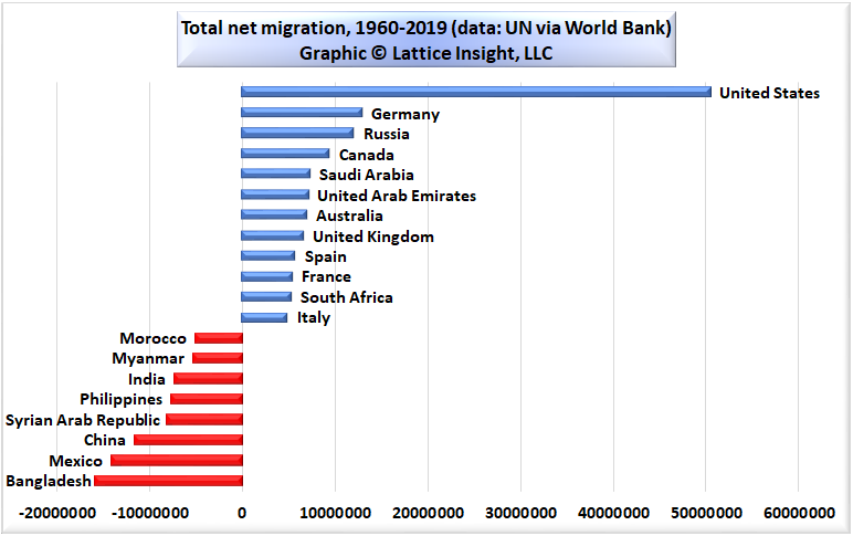
We highlight the countries with the most migration in the following bar chart.
Picture
Clearly, when the people of the world get to vote with their feet, the country that more people want to move to than any other country by far is the United States of America, with more than 50 million net immigrants from around the world in the last 60 years. No other country took in more than 14 million immigrants in the same period.

Total world migration during 1960-2019 was about 182 million. Thus, the United States was the goal of about 28% of all migrants in the world. If we rely on the wisdom of the crowd, it seems that the United States is a desirable place to live after all.
Picture
0 Comments

    Author

    Hal M. Switkay, Ph.D. is a professional mathematician and statistician.

    Archives

    December 2020
    September 2020
    August 2020
    July 2020
    May 2020
    April 2020
    September 2019
    August 2019
    May 2019
    December 2018
    January 2017
    October 2016
    August 2016
    June 2016
    April 2016
    March 2016
    February 2016
    January 2016
    December 2015
    October 2015
    September 2015
    July 2015
    June 2015
    May 2015
    April 2015
    March 2015
    February 2015
    January 2015

    Categories

    All

    RSS Feed

Web Hosting by MyDomain
Website contents copyright Lattice Insight, LLC, 2015. All rights reserved.