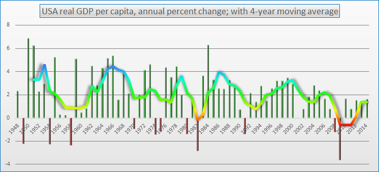
A friend asked me about a recent blog post of mine (see below) discussing real GDP per capita. He found the graph a bit hard to read. Above, I have created a new graph in which we see percent change in real GDP per capita for each year over the previous year, 1948-2014, shown with individual bars (green for increase, red for decrease). The wavy curve smooths this data still further into a trailing 4-year moving average, corresponding to the length of a presidential term. For comparison, the median annual percent change in real GDP per capita from 1948-2014 is +2.2%.
Real GDP per capita is one of the key ingredients of the Switkay USA Economic Vitality Index, posted at the end of each quarter, using the final numbers for the previous quarter. While most politicians prefer to focus on raw GDP numbers, these must be adjusted both for the increase in prices (real) and the increase in population (per capita), to get a sense of overall well-being, in just the same way that unemployment rates must be adjusted for part-timers who need full-time work (U6) and the labor force participation rate.
Real GDP per capita is one of the key ingredients of the Switkay USA Economic Vitality Index, posted at the end of each quarter, using the final numbers for the previous quarter. While most politicians prefer to focus on raw GDP numbers, these must be adjusted both for the increase in prices (real) and the increase in population (per capita), to get a sense of overall well-being, in just the same way that unemployment rates must be adjusted for part-timers who need full-time work (U6) and the labor force participation rate.
 RSS Feed