The policy of the Federal Open Market Committee (FOMC) is like Munchausen syndrome by proxy. This is a psychiatric disorder in which a person may attribute illness to another person, in order that the first party may care for the second party. In some cases, the first party may even harm the second party in order to enable the caretaking to take place.
More colloquially, the Fed’s policy is like the military policy in which “we had to destroy the village in order to save it.” To date, 21.1% of world stock market value as measured by the ACWI has been wiped out – and the Fed is not finished.
How is the US economy doing now? Let us examine the Switkay New Economic Vitality Index™, an updated and simplified version of the index originally published at http://www.latticeinsight.com. This index makes use of the following data from the St. Louis Federal Reserve Bank’s online database, FRED:
- disposable personal income;
- unemployment rate: 25-54 years, men;
- civilian labor force participation rate: 20 years and over, men;
- average hourly earnings of production and nonsupervisory employees: total private;
- consumer price index for all urban consumers: all items;
- average (mean) duration of unemployment;
- market value of gross federal debt;
- industrial production index;
- total population: all ages including armed forces overseas.
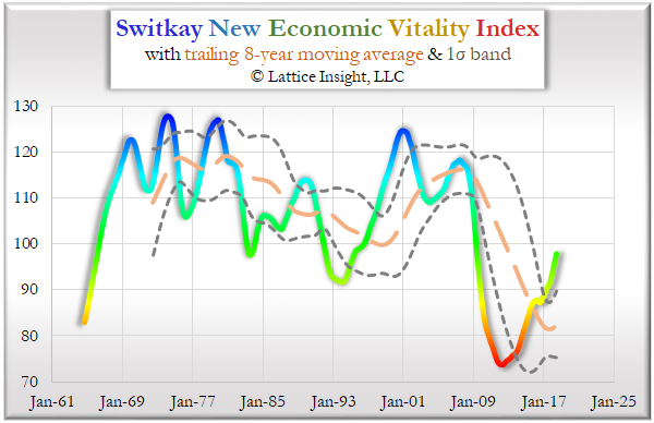
The index is finally approaching mid-range for the first time since early 2009, after the worst recession since World War 2, and does not appear overheated.
The job market, which was crushed during the Great Recession, is now creating jobs at the fastest pace since 1969. In the following graphic, the columns are the years 1948-2018, the rows are the four quarters of the year, and the color represents the job opening rate compared to the six unemployment rates U1 (the narrowest) to U6 (the broadest, underemployment rate). (Some of these series were extrapolated backward from more recent data using linear regression. U1 and U3, the conventional unemployment rate, began in 1948; U2 began in 1967; U4, U5, U6 began in 1994; and the job openings series began in 2001. Correlations for all unemployment series with U3 are above .97; the correlation of job openings with U3 is –.80.)
In red quarters, such as the 5.5 years 2008Q4-2014Q1, there were not enough job openings to cover the U1 unemployment rate. In orange quarters, there were enough job openings to cover U1 but not U2. In yellow quarters, there were enough job openings to cover U2 but not U3; this is the most frequent occurrence, as well as the median of all quarters. In green quarters, there were enough job openings to cover U3 but not U4. In cyan quarters, there were enough job openings to cover U4 but not U5; and in blue quarters, there were enough job openings to cover U5 but not U6.

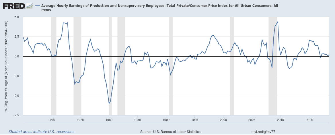
The strong job market has led the “experts” to fear imminent hyperinflation – which has not happened yet – due to out of control labor costs. But here is the year-over-year real hourly wage growth, which currently is close to zero:
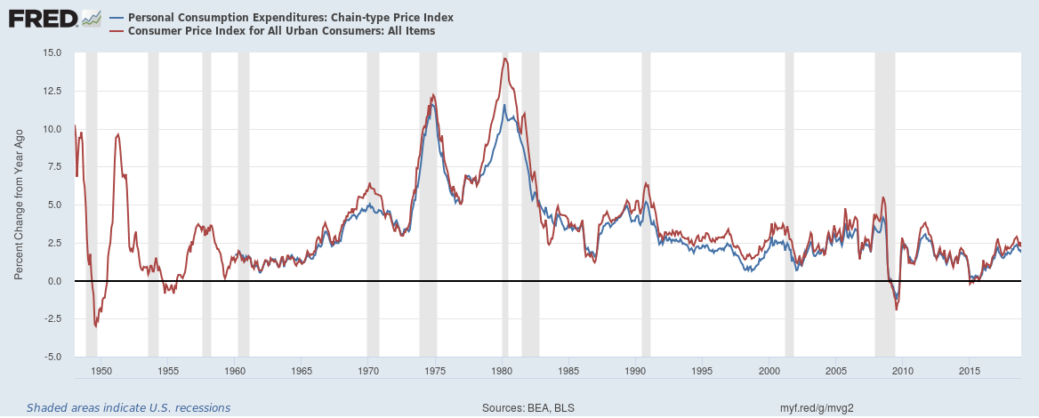
Inflation, as measured by the real-world CPI or the Fed’s preferred (because lower) PCE is lower than its long-term average. The long-term average for CPI inflation is close to 3.5% per year, but the current value is under 3%:
A commodities index ETF, DBC, has plunged 22.4% since its recent high on October 3. This includes oil, natural gas, metals, and agricultural commodities, all of which affect the cost of living.
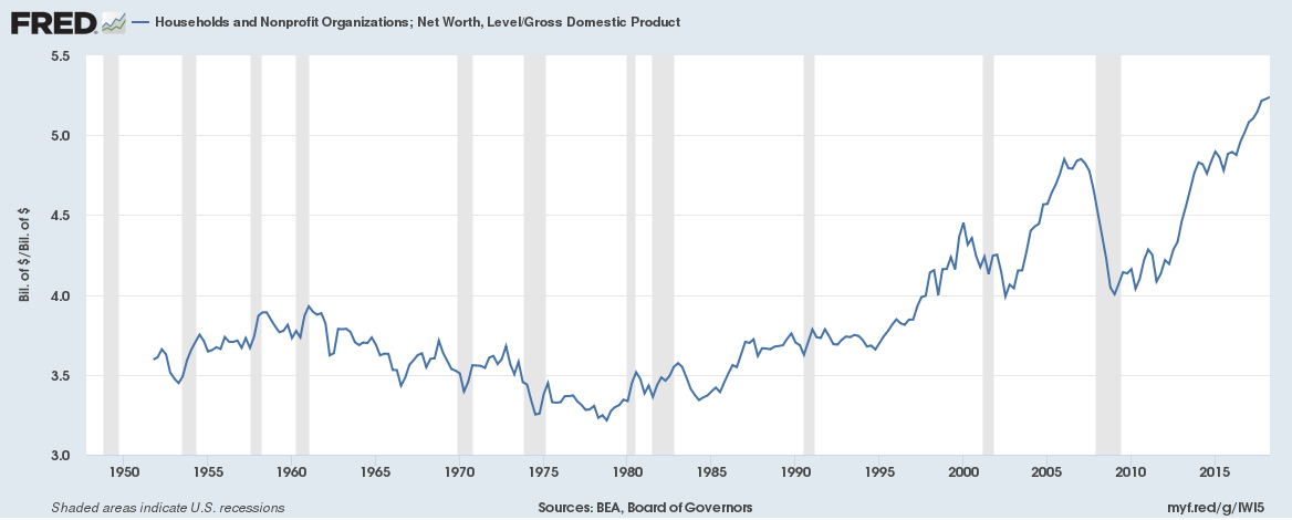
The “experts” believe we are in an asset bubble, partly because of misunderstanding the significance of the ratio of net worth to GDP. The bubble on the right is not the result of hyperinflated assets, but rather of underperforming GDP, as we shall see.
The “experts” believe we are in an asset bubble, partly because of misunderstanding the significance of the ratio of net worth to GDP. The bubble on the right is not the result of hyperinflated assets, but rather of underperforming GDP, as we shall see.
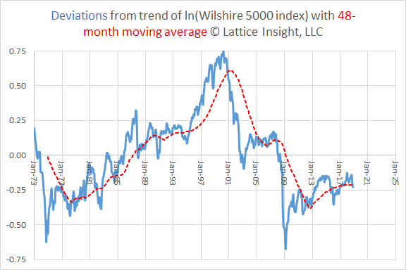
The Wilshire 5000 Index, an index of the broad US stock market, is below its long-term trend, and stands at about the 26th percentile of all such deviations:
Stocks are said to be priced too high relative to earnings. But as the following chart shows (data from www.multpl.com), there was a fundamental change, starting in the 1990s, in how much investors were willing to pay for one dollar of earnings. This change took place shortly after the opening of the major online trading services. The trend model has r-squared = .12, but the two-epoch model has a larger r-squared = .29. In the post-mid-1997 epoch, the current value of the S&P 500 P/E ratio is only at the 47th percentile:
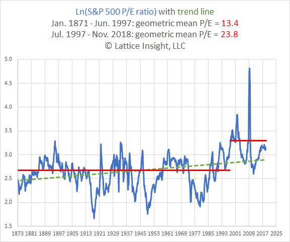
By either measure (price relative to trend, or price relative to earnings in the post-1997 era), stocks are not expensive.
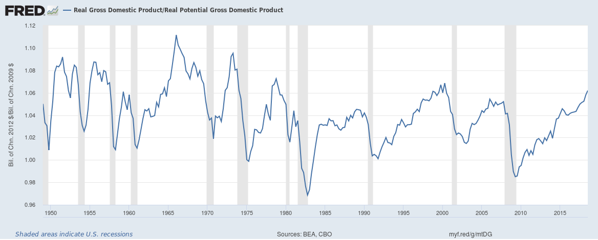
The Fed fears that the economy may be too hot. One way it concludes this is by comparing real GDP to real potential GDP, a unicorn of an economist’s dream, which measures the amount of output of which the economy is capable without incurring inflation. The following chart depicts the ratio of real GDP to real potential GDP, showing that this ratio is almost always greater than one, often substantially so. Perhaps the American economy has more potential than economists give it credit for.
The Fed fears that the economy may be too hot. One way it concludes this is by comparing real GDP to real potential GDP, a unicorn of an economist’s dream, which measures the amount of output of which the economy is capable without incurring inflation. The following chart depicts the ratio of real GDP to real potential GDP, showing that this ratio is almost always greater than one, often substantially so. Perhaps the American economy has more potential than economists give it credit for.
A key element in computing potential GDP is determining NAIRU, the non-accelerating inflation rate of unemployment, an intellectual descendant of the “natural rate” of unemployment. NAIRU and the “natural rate” of unemployment are related to the Phillips curve, the theory that there is a negative association between inflation and unemployment.
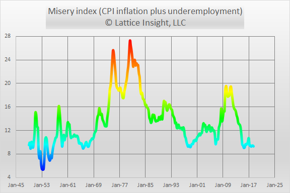
If there is such a negative association, then the misery index, the sum of inflation and unemployment, should vary within relatively narrow bounds over time. The following graph depicts the sum of CPI inflation and underemployment. (We define underemployment to be 1.75 times the unemployment rate, because the quotient of the U6 and U3 rates has traditionally been close to 1.75.) This misery index varies between approximately 5% and 28%, nowhere near constant.
If there is such a negative association, then the misery index, the sum of inflation and unemployment, should vary within relatively narrow bounds over time. The following graph depicts the sum of CPI inflation and underemployment. (We define underemployment to be 1.75 times the unemployment rate, because the quotient of the U6 and U3 rates has traditionally been close to 1.75.) This misery index varies between approximately 5% and 28%, nowhere near constant.
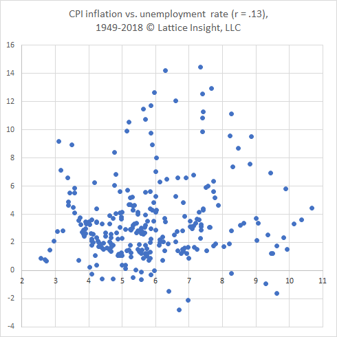
We demonstrate the relation between inflation and unemployment directly in the following graph, in which the correlation is actually positive, not the expected negative number:
It may be hypothesized that inflation is triggered not by low unemployment per se, but rather by unemployment being lower than its “natural rate”, or NAIRU. This false theory is refuted by comparing inflation to the rate to which unemployment exceeds NAIRU, as the following graph demonstrates:
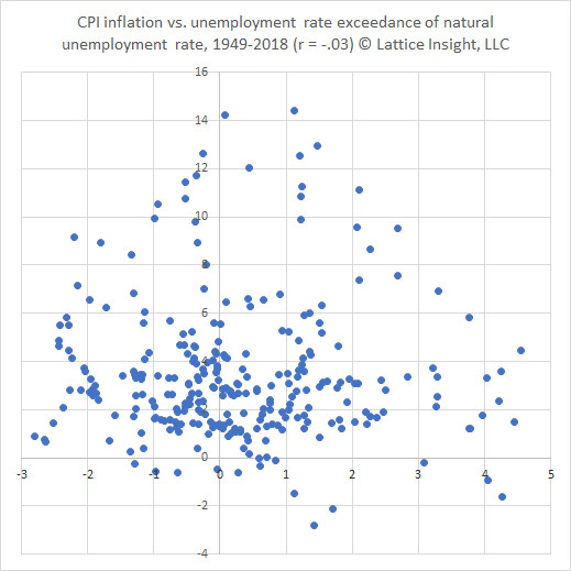
This last graph at last demonstrates the expected negative correlation – but a correlation which is quite close to zero, and demonstrates no statistical significance. The Fed’s recent rate hike decision assumed that the graph above shows a strong negative association. The Congressional Budget Office has determined that the current value of NAIRU is 4.61%, but the unemployment rate is 3.7%. Consequently they deem that inflation is a risk, despite staying below 3% for almost 7 full years; nor is it increasing now.
There are potential risks in the US economy, some of which are related to Fed policies, others of which are the responsibility of the elected branches of government.
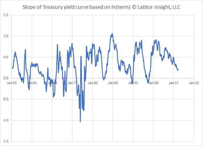
We consider the yield curve, which is getting closer to inversion. Inversion is often measured as the spread between two specific interest rates, such as the Treasury 2- and 10-year notes. We introduce an apparent innovation: the slope of the yield curve, which makes use of interest rates on all terms of fixed rate Treasury bills and notes. This is the slope of the regression line of interest rates on the natural logarithm of their terms. The long-term average value of the slope is about 0.32; its current value is 0.19. The following chart shows that the slope of yield curve is not yet negative, but it is getting close enough to signal the potential for recession soon.
There are potential risks in the US economy, some of which are related to Fed policies, others of which are the responsibility of the elected branches of government.
We consider the yield curve, which is getting closer to inversion. Inversion is often measured as the spread between two specific interest rates, such as the Treasury 2- and 10-year notes. We introduce an apparent innovation: the slope of the yield curve, which makes use of interest rates on all terms of fixed rate Treasury bills and notes. This is the slope of the regression line of interest rates on the natural logarithm of their terms. The long-term average value of the slope is about 0.32; its current value is 0.19. The following chart shows that the slope of yield curve is not yet negative, but it is getting close enough to signal the potential for recession soon.
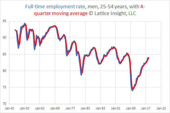
One of the most troubling charts depicts full-time employment for men aged 25-54 years. This is the segment of the labor market with the highest labor force participation rate. This segment was crushed in the Great Recession and is now in partial recovery, but is also suffering from a long downtrend that may be related to trade policies or changing social mores.
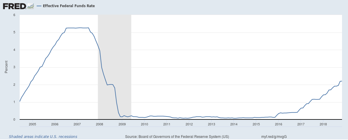
How does the Fed make its decisions, and how should it make its decisions? We are assured indignantly that the “experts” know what they are doing and do not allow political considerations to interfere, not one little bit. Thus, many “commoners” are confused by the apparent coincidence of interest decisions and political control in the White House:
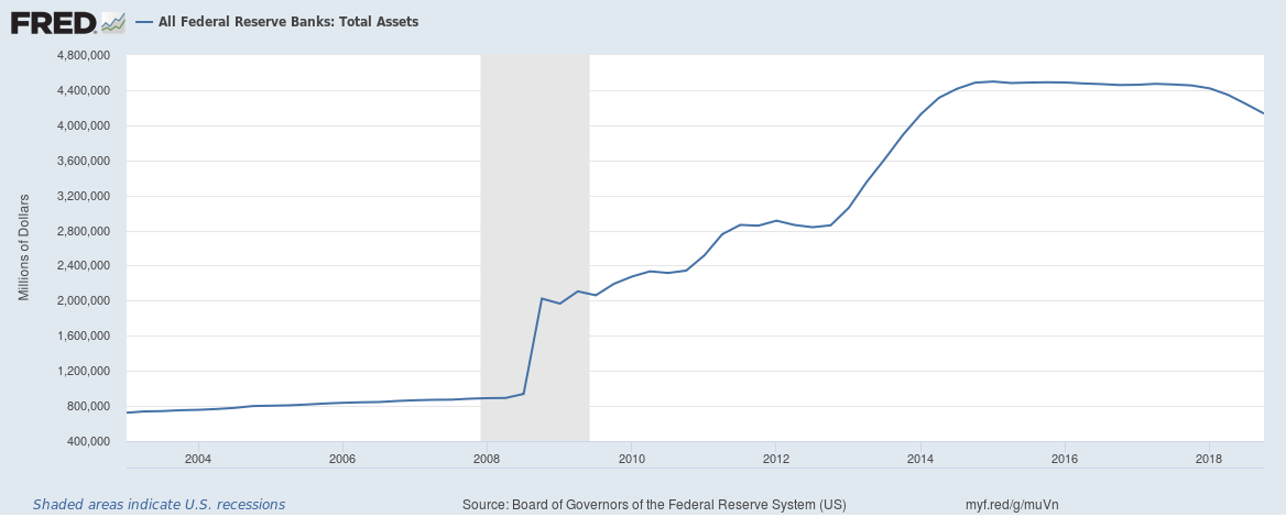
“Commoners” are also confused as to why the Fed’s unwinding of its massive $4 trillion assets accelerated only after the most recent presidential election:
The Fed claims to be making decisions based on data. The Fed is clearly blissfully unaware of the danger signals coming from world bond markets and stock markets, perhaps on the fatuous theory that “The market is not the economy” (except if individuals lose their savings and businesses cannot afford to borrow, but other than that there is no connection whatsoever between the market and the economy).
One proposed method of Fed rule-making is a so-called Taylor rule, named after Stanford economist John Taylor. It proposes that the federal funds rate should be a linear function of inflation and the logarithm of the quotient of GDP and potential GDP, on the basis that optimization of these variables falls within the Fed’s mission, along with maximizing employment.
We cannot re-run history as a series of experiments with different Taylor rules. However, we can examine the existing data to determine what Taylor-style rule best describes the Fed’s decision-making.
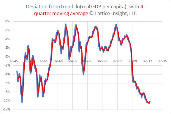
To this end, it is important to appreciate the sheer magnitude of the difference between the size of the economy and its long-term trend. The following chart shows the deviation from the trend for the natural logarithm of real GDP per capita (GDP adjusted for inflation and for population). Unlike the earlier chart regarding potential GDP, it appears that the American economy is still 10% below its long-term trend:
One proposed method of Fed rule-making is a so-called Taylor rule, named after Stanford economist John Taylor. It proposes that the federal funds rate should be a linear function of inflation and the logarithm of the quotient of GDP and potential GDP, on the basis that optimization of these variables falls within the Fed’s mission, along with maximizing employment.
We cannot re-run history as a series of experiments with different Taylor rules. However, we can examine the existing data to determine what Taylor-style rule best describes the Fed’s decision-making.
To this end, it is important to appreciate the sheer magnitude of the difference between the size of the economy and its long-term trend. The following chart shows the deviation from the trend for the natural logarithm of real GDP per capita (GDP adjusted for inflation and for population). Unlike the earlier chart regarding potential GDP, it appears that the American economy is still 10% below its long-term trend:
We have constructed a Taylor-style rule in which we predict the federal funds rate based on three variables. The most significant predictor is the year-over-year (YOY) percentage increase in the consumer price index (CPI). The second most significant predictor is the deviation of the natural logarithm of real GDP per capita from its long-term trend. The third most significant predictor is the YOY percentage increase in real GDP per capita. Several notes follow.
1) The unemployment rate has essentially zero correlation with the federal funds rate.
2) The model we produce attempts to describe the federal funds rate as it was, not necessarily as it should be.
3) Our model-making method is dynamic. As new data comes in, the long-term trend of real GDP per capita will adjust, and so will deviation from this trend.
Below, we graph what the federal funds rate was in green, what the model predicted in blue, and a 4-quarter smoothing of the predicted rate in red.
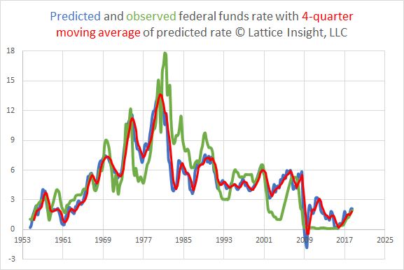
This model achieves r-squared = .68, with a standard error of about 2%.
We cannot explain purely mathematically why the observed federal funds rate was so much excessively higher than the predicted rate during the years 1981-1984, or why it was so excessively low in 2003-2004 and 2011. (For the record, second-order and interactive terms were not significant.)
Our model suggests that the federal funds rate is close to its predicted level. In the second and third quarters of 2018, we predict a rate between 2% and 2.25%; the actual rates were between 1.5% and 2%. The latest raise, to a range of 2.25-2.5%, does not seem warranted. I have seen no data supporting the FOMC’s belief that a rate near 2.9% is “neutral” in the current environment, particularly with the 10-year Treasury yielding 2.74%.
Some have argued that savers have been punished by low rates for too long. The chart above makes one wonder why the Fed only realized this after the last presidential election. I recently opened a 12-month CD with a well-known national bank for 2.6%; how much more should a 12-month CD pay?
I would like to see the Fed announce that the proposed rate hikes for 2019 are off the table for now. The last rate hike should be repealed. The liquidation of the Fed’s assets should continue, but more slowly: perhaps cut in half. Finally, the Fed should commit to a Taylor-style rule incorporating the inflation rate, the deviation of real GDP per capita from its long-term trend, the percentage growth in real GDP per capita, the labor force participation rate, the U6 underemployment rate, and the slope of the yield curve, as defined earlier. Then the Fed may regain some of the trust it has squandered recently.
 RSS Feed