Ah, the "experts" - often wrong, but never in doubt. They merely make their pronouncements from Mount Olympus, or Mount Bloomberg News, or Mount CDC/NIH, or Mount Imperial College - and mere mortals prostrate themselves. No independent thinking welcome here!
Back in the old days before coronavirus, we used to evaluate prognostications on their accuracy. We even teach that still, although the concept is clearly old-fashioned.
When I turned on the business news this morning, I heard that the consensus forecast of the "experts" was that the (U3) unemployment rate for August, 2020 would decline slightly from July's 10.2% to roughly 9.8%. I thought that was too high. I expected a rate around 9.2%, with a possibility of being slightly below 9%. The true unemployment rate for August was 8.4%.
My inexpert guess was much closer than that of the experts. How was that possible? Don't they have their fancy terminals and databases and expensive statistical software, that can compute multivariate exogenous seasonal autoregressive fractionally integrated moving average time series? How can an amateur with Excel under one arm hope to top that? Abandon hope, all ye who enter here!
It seems that there is a connection between the U3 unemployment rate, reported monthly, and the weekly insured unemployment rate, which appears as part of the initial claims news release. The insured unemployment rate only refers to that part of the labor force covered by unemployment insurance. The rate is the ratio of continuing unemployment claims to the insured labor force, and has been reported weekly since January, 1971.
While not identical, it seems that the two rates should be closely related. The following scatterplot relates the unemployment rate (UNRATE on the FRED online time series database) to monthly aggregates of the insured unemployment rate (IURSA). For reference purposes, in the period from January, 1971 to February, 2020, the mean value of IURSA was 2.8, and for UNRATE it was 6.2. In February, 2020 alone, IURSA was 1.2 (a record low), and UNRATE was 3.5 (about a 50-year record low). This point appears in the lower left of the graph.
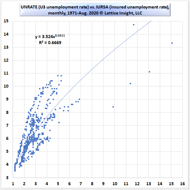
The fit shown above is a power law fit, with R-squared over 66%. The large cloud of 590 observations to the lower left consists of the months from January, 1971 to March, 2020. April, 2020 is the highest point; May, 2020 is the point farthest to the right; then June, July, and August move down and to the left. The five outliers to the upper right have very little effect on the power law equation or R-squared.
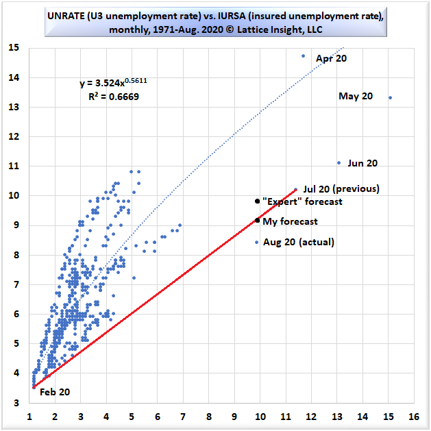
On the first Thursday of the month (September 3 in this case), we usually know the average IURSA for the previous month. This was 9.9% for August, 2020. The question is what should have been expected for UNRATE. The model from the previous month tells us that the best point estimate is about 12.6%.
The July IURSA was 11.4%. Does it seem reasonable that when IURSA declined 1.5% month-over-month to 9.9%, that the closely related UNRATE should have increased from July's 10.2% to 12.6%? Of course not.
Rather than regressing to the best-fit curve, I am proposing that the points themselves are regressing to their pre-pandemic level (1.2%,3.5%) as ordered pairs. This is visible in the sequence of points from May through August, 2020. Even though we only knew the points from May through July, the IURSA coordinate for August was known to continue that trend. I deduced that it was more reasonable to project UNRATE on a line connecting July, 2020 (11.4%,10.2%) to February, 2020 (1.2%,3.5%). This is shown in the graph below.
Although I too overestimated August's unemployment rate, this simple method outperformed the experts. Sometimes simplicity is a virtue.
 RSS Feed