The question on everyone's mind these days is: how racist is America? To put things in context, it would help to compare America to other countries.
We rely on a graphic from a Washington Post story: www.washingtonpost.com/news/worldviews/wp/2013/05/15/a-fascinating-map-of-the-worlds-most-and-least-racially-tolerant-countries/
This story reported on a study done in 2013 by the World Values Survey, based in Sweden. They asked people around the world whether they were willing to have a neighbor of a different race. A higher score on this survey represents lower racial tolerance, shown in red on the map. A lower score represents higher tolerance, shown in blue on the map; see below.
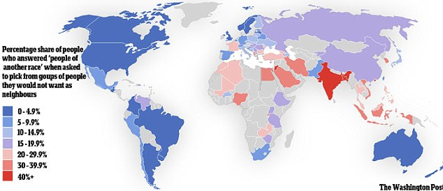
Jordan and India were by far the least racially tolerant countries in the survey. The Americas (including the United States), northern Europe, Australia, and New Zealand were the most racially tolerant.
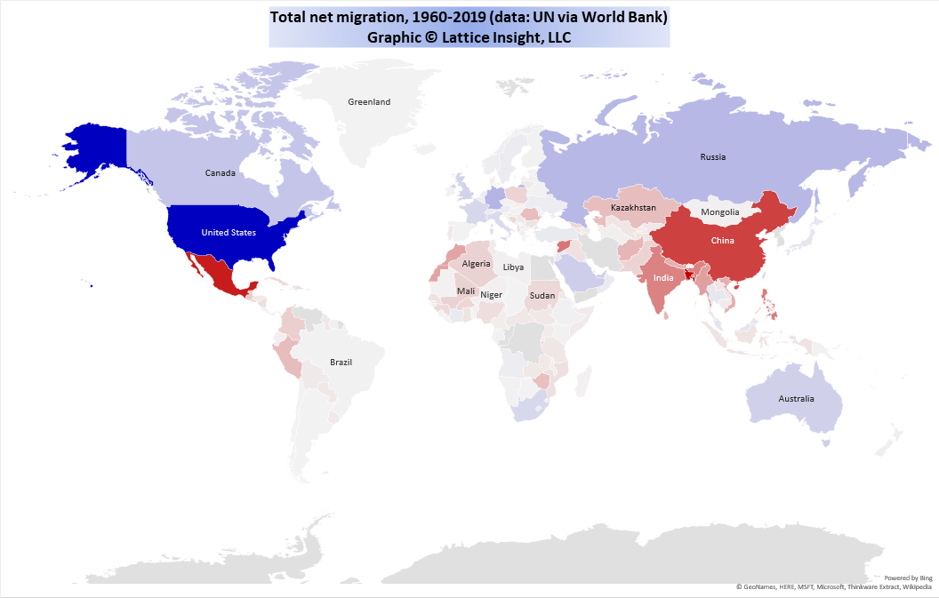
Next, we examine migration data from the United Nations. The following map represents total net migration from 1960 to 2019. Blue countries have net immigration (inflow of people), red countries have net emigration (outflow of people), and the deepness of the color represents the number of people migrating.
Next, we examine migration data from the United Nations. The following map represents total net migration from 1960 to 2019. Blue countries have net immigration (inflow of people), red countries have net emigration (outflow of people), and the deepness of the color represents the number of people migrating.
We highlight the countries with the most migration in the following bar chart.
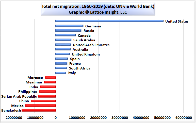
Clearly, when the people of the world get to vote with their feet, the country that more people want to move to than any other country by far is the United States of America, with more than 50 million net immigrants from around the world in the last 60 years. No other country took in more than 14 million immigrants in the same period.
Total world migration during 1960-2019 was about 182 million. Thus, the United States was the goal of about 28% of all migrants in the world. If we rely on the wisdom of the crowd, it seems that the United States is a desirable place to live after all.
Total world migration during 1960-2019 was about 182 million. Thus, the United States was the goal of about 28% of all migrants in the world. If we rely on the wisdom of the crowd, it seems that the United States is a desirable place to live after all.

 RSS Feed